This week’s PPCChat session was hosted by Kirk Williams and the discussion was about the new AdWords interface, tour into the features with PPCChat participants sharing their views about it, what they like or dislike in the interface and more.
Here is the screencap of the discussion that took place.

Q1: Let’s do a Poll to start off the Chat. Feel free to comment in follow-up tweets with more context. What is the primary reason you have resisted the New AdWords UI? (choose the strongest reason)
Functionality – it’s come a long ways, but I was annoyed by the fact we were thrown into the interface before it was fully developed (and while needing to do real client work efficiently) – @timothyjjensen
They should have put a big “Beta” label on it & pushed it a little more conservatively. – @robert_brady
Forced myself to use new UI exclusively for the last 2 weeks. Definitely a learning curve, but I’ve grown to like it – @ToeKnee_C
I don’t love the new UI, but I’ve been using it almost exclusively for the last 3+ months. The first time AdWords through me in the new UI, I couldn’t figure out how to get back to the old UI for 30 sec or so, so I thought “well, I better just figure this out” – @_ericm
I’m here to represent the minority who made the leap and now I don’t like the old UI. – @MarkIrvine89
If it isnt broke, don’t fix it. More so, don’t put new features only in the new UI, that can just as easily be operated in the current UI – @JonKagan
Design and Functionality. pretty much threw it at you and hoped it would stick… ‘here you go lad, off you pop’ is how i felt about it. Could have been rolled out better – tell me if i missed some big video guides etc about it! – @JasonJBDenny
The design is in line with the data studio and 360 rollout. I don’t love it, but I get it. – @JuliaVyse
Q2: Let’s talk Overview. Take a few minutes to dig into one account and spend time looking at specifically the “Overview” tab in multiple views. Anything you dislike, or find helpful with this new dashboard?
I LOOOOOVE the Overview graph as hourly for an individual day. It’s helped me a lot, especially in comparisons and visually tracking to previous year same day – @PPCKirk
Lots of great thinking behind the Overview area. Some data visualization that I like. – @robert_brady
I was just going to say that I didn’t like that you could only view Clicks, Imp, Conv & Cost on the main graph…then I realized there are drop downs on those and they can be changed! – @_ericm
I like the Overview’s quick snap shots. We’ll see how much I use them but at first glance seems pretty cool. – @mcgregor212
The auction insights graphic is much more interesting than the old report – @dotcentrex
The overview tab might be my favorite part of the new UI, the visuals are great for Auciton insights, day and hour etc. also like the search terms card. It definitely is an ‘Overview’ but is great for a quick account ‘health check’ – @ToeKnee_C
Biggest changes’ and ‘New words have appeared…’ sections are pretty cool i have to admit. The latter i can see being especially helpful. – @JasonJBDenny
Interesting that in the Opportunities tab it is recommending removing ‘redundant’ keywords…. which just so happen to be my client’s MAIN BRAND keywords in an Exact match ad group. – @JasonJBDenny
Q3: Let’s dig into the Campaigns/Ad Groups tabs. Setup and analyze the columns options in an account, is there anything in here that would change the way you create your columns in the New UI? Any new columns?
I don’t like that they couldn’t carry over the columns from the old interface. Doesn’t seem like a hard thing to do & would have really helped ease people into the new interface better. – @robert_brady
FWIW, Attributes for campaign and ad group types & settings are more visible here. – @MarkIrvine89
I just discovered the show less/more space button (to the right of the download button). That’s really helpful! – @_ericm
FOR THE LOVE OF GOD, NO HORIZONTAL SCROLLING PLEASE – @Mel66
The columns no longer have vertical lines between them & that makes a big difference in readability. Also, the screen stretches too wide – literally to the extreme edge of your browser, which contributes to what you’re feeling when you look at it. – @NeptuneMoon
It may need time getting used to but for me the old UI was easier to read/follow the data. New UI missing Vertical column lines? – @mcgregor212
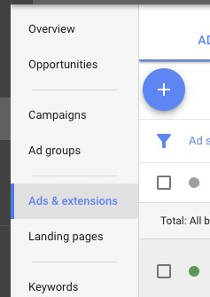
Q4: Take a look at the Ads & Extensions. Any new extensions available to you, anything you’ve tried that is great or anything you see that you want to try? Take a few minutes to analyze success and adding Extensions into accounts/campaigns.
I’ve been happy to see some new extensions in the New UI. Specifically the promotions Ext! We used that a bit through the 2017 holidays. – @PPCKirk
The default view of “All extensions” is not helpful. Too busy and cluttered. – @robert_brady
With columns, I think that anytime CTR is displayed you should see Avg Position too (since they’re very related) but Avg Position isn’t a default column. – @robert_brady
Associations are awesome for extensions and make things easier…AFTER you get them all reconfigured. It was such a paradigm shift. – @robert_brady
Promo extension looks good. I guess this alleviates a bit of pressure of constant disapprovals from the GMC promo set-up! (Myabe) – @JasonJBDenny
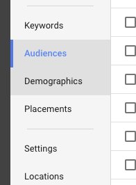
Q5: Take a look at Audiences and Demographics tabs. Anything new here? Anything worth pointing out, any questions about these?
I still don’t trust demographic data… for example – in Google’s eye i am 81 (i am not btw). So i wonder what percentage of those who fall into age ranges, other than Unknown, are actually accurate. – @JasonJBDenny
HHI was in a dumb place before, but that’s because the data is based on Census data by zip code. – @robert_brady
This consolidates the GDN, YT, and AdWords audiences & demos in one place because good. Also “HHI” is now a demographic rather than an…advanced location? – @MarkIrvine89
My HHI data can now be combined with age and gender! – @JuliaVyse
To better understand the data have to get your filtering and columns setup – @mcgregor212
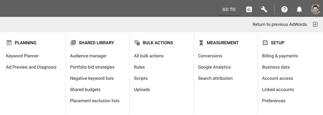
Q6: Click the Wrench icon top right (RESIST THE ANIMAL INSTINCT TO CLICK THE “RETURN” BUTTON YOU’VE BEEN CLICKING FOR MONTHS). Dig around here for a few minutes. Any interesting findings?
Custom Affinity Audiences/ Custom Intent audiences (New UI) are pretty cool – I’ve seen some initial success with them on the GDN and you can’t create them in the old UI. – @taylorchatt
Search Attribution. though this could be risky with clients who want to tinker around with things. – @JuliaVyse
I thought that the wrench was fine. Just mixed items that were on the left and top from before. I do tend to click on “return to previous adwords” as soon as I get frustrated however due to the poor usability, column issues, etc… – @lchasse
I would like to dive more in the Audience Manager tab. Seems like a cool tool to add audiences…etc. – @mcgregor212
But seriously, no Display Planner link? And the Keyword Planner link takes you into the old interface. – @robert_brady
A little sad i know, but the Billing & Payments experience is lot smoother i find. – @JasonJBDenny
Keyword Planner – ‘You can use this tool to generate ad group and keyword ideas. It doesn’t guarantee improved performance.’ When WILL Google guarantee me improved performance – @JasonJBDenny
Q7: Is there something big and new about the UI we should all know about that we didn’t cover in our Clicking Tour? Important functionality removed or added?
The Keyboard Shortcuts actually look somewhat promising. If they add additional shortcuts to other commonly used pages (e.g. Search Terms), it could make navigation really speedy. See shortcuts here: https://support.google.com/adwords/answer/7282037?hl=en – @_ericm
Agreed keyboard shortcuts are the only way I can actually use the new UI. Press G then T to search for whatever you’re look for. or press ? to pull up a list of shortcuts – @ToeKnee_C
This is pretty cool – as i assume we all ignored this when it was first released…. Guided Steps – @JasonJBDenny
Opportunity tab seems cluttered. I’m sure somehow they can clean it up. – @mcgregor212
It took AdWords far too long to include a total row for filtered items (but it’s there now) – @robert_brady
Q8: Alrighty, time for us to speak directly to AdWords! What’s one thing you would like to ask AdWords to do to help the New UI get even better? Please reply to this tweet so it’s easier for them to scroll down through the responses.
I noted this earlier, but porting our column preferences from the Old UI for all tabs so what we see in the New UI better resembles the Old UI would be much appreciated. – @PPCKirk
Make rows more visually distinctive for visual data processing. Even if that means slight grays on every other row. Sounds dumb, but I find myself getting lost a lot easier in the New UI when I side scroll. – @PPCKirk
On New dashboard all the experimental campaigns are appearing with the current campaigns under the campaign tab. These should come separately like the old version. User experience in the old version was better.- @kaushikppc
Make it very easy to see visual difference between active and paused campaigns in left nav. Bring back vertical lines in column views. Decrease responsive expand to less than 100% of window. Get GA data in there. – @NeptuneMoon
I have sent this to them already, but when I filter accounts on my main mcc screen, being able to just right click and open the client in a new window. It helps my work-flow to go down one by one working on accounts instead of having to go back to the home screen. – @lchasse
Bring back Topics and Interests to Gmail ads. Retirement is a broad enough space that we can’t count on just affinity for this group. – @JuliaVyse
Expand your age range for older people. 65+ people do NOT shop/live/behave the same way 80+ people do. – @JuliaVyse
Please make segments simpler and savable. I have several conversions, only one or two of which are worth $$. let me save my segments rather than default to ALL. – @JuliaVyse
Bring columns over from the old interface. Huge time suck to redo them all in the new interface…for every account…when you have many. – @robert_brady
Give the Auction Insights its own tab in the Keywords section so I don’t have to click “Search Terms” twice to see them. – @robert_brady
Import all our column customisations automatically into the new UI accounts. – @JasonJBDenny
Need to make every tab/view…etc not so cluttered. Everything seems so bunched together for some reason. – @mcgregor212
PPCChat Participants
- Kirk Williams – @PPCKirk
- Robert Brady – @robert_brady
- Mark Irvine – @MarkIrvine89
- Julie F Bacchini – @NeptuneMoon
- Julia Vyse – @JuliaVyse
- Garrett McGregor – @mcgregor212
- Eric Marshall – @_ericm
- Melissa Mackey – @Mel66
- Timothy Jensen – @timothyjjensen
- Jon Kagan – @JonKagan
- Jason Denny – @JasonJBDenny
- Taylor Chatterton – @taylorchatt
- Tony Coloso – @ToeKnee_C
- Kaushik Mukherjee – @kaushikppc
- Larry Chasse – @lchasse
Related Links:


Stop the wasted ad spend. Get more conversions from the same ad budget.
Our customers save over $16 Million per year on Google and Amazon Ads.